
Mastering Flex Items - Unveiling Their Powers
Welcome back, brave designer in the making! In this enchanted realm of Flexbox, we’ve activated the magic within the flex container. Now, it’s time to explore the mystical abilities of its apprentices, the flex items.
The Flex Property: A Source of Power
The true enchantment lies in the flex property. This mystical attribute allows your items to grow, shrink, or remain a fixed size within the container.
.item {
  flex: 1; /* Grow and shrink equally */
}- flex-grow: The ability to grow relative to its siblings. By default flex item are not allowed to grow (flex-grow: 0).
.item { flex-grow: 1; /* Allows the flex item to grow and take the remaining space */ } - flex-shrink: The power to shrink relative to its siblings. By default, flex items are allowed to shrink until they can’t anymore (flex-shrink: 1).
.item {
  flex-shrink: 0; /* Do not shrink; maintain the original size */
}
Taking back a simple example from our previous episode, will see how we can make a flex item take up the free space inside its flex container.
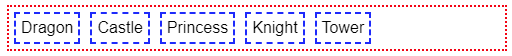
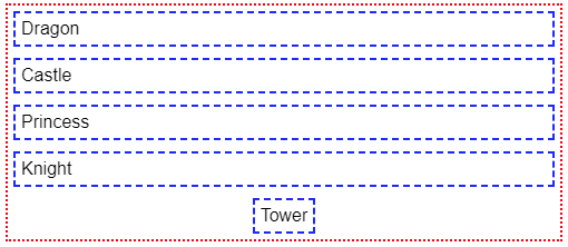
Let’s say that we want to expand our castle which is too small at the moment:
.castle {
  flex: 1; /* The flex item is now allowed to grow (and still allowed to shrink). */
}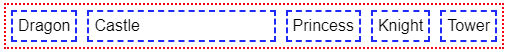
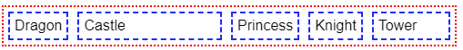
Ok, now our castle is quite big compared to our tower which remains pretty small, let’s fix that. We want our tower to be able to grow as well but not as big as our castle. If we set our tower to flex: 1 as well, it will share the remaining space with our castle and have the same size. But, if we set our castle to a higher value, it will take more of the remaining space, let’s try it:
.tower {
  flex: 1; /* The tower is now allowed to expand */
}
.castle {
  flex: 2; /* Our castle will take twice the space */
}
Obviously, this works whatever the direction of our flex container.
The Alignment Incantation: align-self
While the align-items property works on all flex items collectively, each item has the power to align itself uniquely using the align-self property.
.item {
  align-self: flex-end; /* Align this item to the end on the cross axis */
}
Possible values are the same as for align-items.
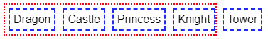
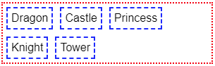
Nothing better than a good example. Let’s take back the demonstration from our previous episode (again) where the flex container had a direction of column and every flex item stretched on the cross axis:
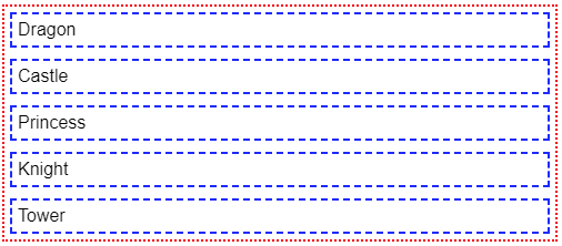
Now what if we wanted our tower to be centered instead ?
.container {
  display: flex;
  flex-direction: column;
  gap: 10px;
}
.tower {
  align-self: center;
}
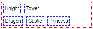
The Reordering Spell: order
In this mystical land, the order property allows you to rearrange items without breaking a sweat.
.item {
  order: 2; /* Move this item to the end of the container */
}
The higher the value, the « heavier » the flex item will become, meaning it will move towards the end of the flex container (whatever the direction). By default all flex items have a neutral value of 0. You can set a positive or negative value to rearrange them in the order of your liking.
Controlling the Flow: flex-wrap and flex-flow
To add another layer of magic, we have two more spells to control the flow of our layout, these apply to the flex container:
- flex-wrap: This spell determines whether the flex container should wrap its items onto multiple lines (or columns if the main axis is vertical).
Possible Values:.container { flex-wrap: wrap; /* Allow items to wrap onto multiple lines */ }- nowrap (default): By default, the flex items are not allowed to wrap and start a new line (or column depending on the direction) when there is not enough space in the container, meaning they will overflow the flex container.
- wrap: flex items are allowed to create new lines (or columns) if there is no more space.
- wrap-reverse: flex items will wrap onto multiple lines (or column) but in reverse.
- nowrap (default): By default, the flex items are not allowed to wrap and start a new line (or column depending on the direction) when there is not enough space in the container, meaning they will overflow the flex container.
- flex-flow: A combination spell that combines
flex-directionandflex-wrapin one declaration..container { flex-flow: column wrap; /* Column direction with wrapping */ }- First Value:
flex-direction(row,row-reverse,column,column-reverse) - Second Value:
flex-wrap(nowrap,wrap,wrap-reverse)
- First Value:
Nesting and Harmony
Flexbox encourages nesting, allowing you to create intricate layouts within layouts. The child wizards inside a flex item can also wield their own Flexbox spells.
.item {
  display: flex; /* Activate Flexbox for this item too! */
}
Now that you’ve uncovered the powers of Flexbox, go forth and experiment with these spells. Create layouts that were once only dreams in the realm of web design. Flexbox is your trusty companion, ready to turn your layout challenges into a fairy tale of design success. Happy coding! 🌟
Photo of Carl Barcelo on Unsplash