Unleashing the Magic of Flexbox - The Basics
Welcome to the whimsical world of Flexbox! 🚀 If you’ve ever felt the frustration of trying to center elements or create equal-height columns in CSS, fear not—Flexbox is here to sprinkle some layout magic into your web design adventures.
The Flex Container: Setting the Stage
In the enchanting land of Flexbox, our protagonist is the flex container. This magical entity is the parent element that holds its spellbound apprentices, the flex items (child elements). Let’s learn how to activate the Flexbox magic!
.container {
  display: flex; /* Activate the Flexbox magic! */
}
The Direction Spell: flex-direction
The flex-direction property sets the direction of the main axis along which flex items are placed. Let’s explore the available directions and how they impact alignment:
- Row (default):
.container { flex-direction: row; /* Horizontal alignment */ }- Main Axis: Left to right
- Cross Axis: Top to bottom
- Row-Reverse:
.container { flex-direction: row-reverse; /* Horizontal alignment in reverse order */ }- Main Axis: Right to left
- Cross Axis: Top to bottom
- Column:
.container { flex-direction: column; /* Vertical alignment */ }- Main Axis: Top to bottom
- Cross Axis: Left to right
- Column-Reverse:
.container { flex-direction: column-reverse; /* Vertical alignment in reverse order */ }- Main Axis: Bottom to top
- Cross Axis: Left to right
Aligning and Justifying Spells
Flexbox provides spells—ahem, properties—that allow you to align and justify your elements effortlessly. No more potions or complicated rituals required!
- justify-content: This spell controls the alignment along the main axis.
Possible Values:.container { justify-content: center; /* Center items along the main axis */ }- flex-start: flex items (child elements) will be packed to the start on the main axis. The is the default value.
- flex-end: flex items will be packed to the end on the main axis.
- center: flex items will be placed at the center on the main axis.
- space-between: the remaining space on the main axis will be distributed evenly between the flex items. The first flex item will be pushed at the start and the last at the end.
- space-around: the remaining space on the main axis will be distributed evenly between the flex items. Half of the space between two flex items will be set before the first item and after the last item.
- space-evenly: the remaining space on the main axis will be distributed evenly between the flex items and before the first item and after the last item. These are the main values, if you want more, the MDN is at your service : https://developer.mozilla.org/en-US/docs/Web/CSS/justify-content
- align-items: A powerful spell for alignment on the cross axis.
Possible Values:.container { align-items: flex-start; /* Align items to the start on the cross axis */ }- stretch: flex items (child elements) will stretch on the cross axis, meaning there won’t be anymore space around the item on this axis (either full height if main axis is horizontal or full width if main axis is vertical).
- flex-start: flex items will be packed to the start on the cross axis.
- flex-end: flex items will be packed to the end on the cross axis.
- center: flex items will be placed at the center on the cross axis. The MDN is always here for you if you need it https://developer.mozilla.org/en-US/docs/Web/CSS/align-items
Spacing Spell
You will notice that our flex items are all packed together if you don’t space them of course. There is a magic property that will allow you to set a gap between all your flex items.
.container {
  display: flex;
  gap: 20px; /* Applies a gap of 20px between each row and each column */
}
You can set a different gap for rows and columns by setting two different values:
.container {
  display: flex;
  gap: 10px 20px; /* Applies a gap of 10px between each row
                     and 20px between each column */
}
Casting the Spells
It’s time to see those spells in action now ! Here are some demonstrations that will get you started so you can cast them on your own afterwards.
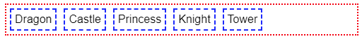
Default direction set to the container:
/* We add some borders and padding for effect */
.container {
  display: flex;
  border: 2px dotted red;
  padding: 5px;
  gap: 10px; /* We only have one row so the gap only applies to colunms here */
}

/* Flex items */
.container span {
  border: 2px dashed blue;
  padding: 5px;
}
What if we change direction and reverse the default one ?
.container {
display: flex;
flex-direction: row-reverse;
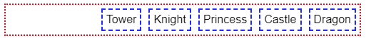
}What if your want to space evenly the flex items ?

.container {
  display: flex;
  flex-direction: row-reverse;
  justify-content: space-evenly;
}
What happens if you want to set the main axis to column and not row ?
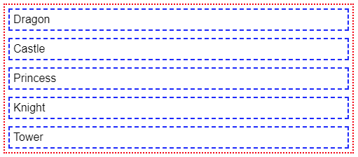
.container {
  display: flex;
  flex-direction: column;
  justify-content: space-evenly;
  gap: 10px;
}
As you can see, our flex items are now stacked on top of each other, but they are not spaced evenly anymore, only the gap remains, why is that ? Remember that by default the height of our container is equal to the sum of its child elements (plus the gaps, the padding and the borders of course). If you want space-evenly to have any effect here, you will have to set a bigger height to the container.
What about the alignment on the cross axis ? You probably noticed that our flex items take the full width of the container, they stretch to take all the space. We can change that of course.
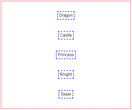
.container {
  height: 400px; /* Allows the items to be spaced on the main (vertical) axis */
  display: flex;
  flex-direction: column;
  justify-content: space-evenly;
  align-items: center; /* Our items don’t stretch anymore */
}
This is a good stopping point for that first part, because yes, there are more flexible spells to be taught!
Stay tuned for Part 2, where we’ll dive deeper into the magic of Flexbox, focusing on the flexibility of individual flex items! 🌟
Photo of Wesley Tingey on Unsplash