Gridception Part 1 - Navigating the Grid Universe with Columns and Rows
Ahoy, brave adventurers of the web! Today, we embark on a perilous yet thrilling journey through the mysterious realm of CSS Grid. Buckle up as we unveil the ancient scrolls of grid sorcery, where columns and rows dance in harmony. Prepare for a quest where fractions, “auto”, and “repeat” weave the fabric of fantastical layouts. And, of course, we’ll toss in a pinch of media query magic to make our grids responsive to the whims of screen size.
The grid system provides a robust framework for creating complex and responsive layouts, allowing for precise control over the placement and sizing of elements within a container.
The Grid Foundation - Defining Templates:
Picture this: our grid is a majestic kingdom, and we are the architects of its destiny. With the power of grid-template-columns and grid-template-rows, we dictate the very structure of our domain. We can explicitly define how many columns and/or rows we want for our beautiful 2D grid.
Behold:
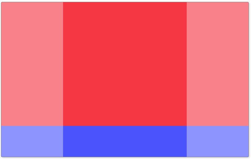
.kingdom {
  display: grid;
  grid-template-columns: 1fr 2fr 1fr; /* Behold the three columns,
                                         with the middle one twice as wide! */
  grid-template-rows: auto 100px; /* Gaze upon the two rows—one
                                     adapting to content, the other fixed at 100px! */
}
fr (fraction) units make CSS Grid layouts flexible and responsive, offering a share of the available space to each element. In the above example we postulate that our kingdom’s width is divided in 4 pieces (1 + 2 + 1) which gives us 25% for each fraction. Now, as we only have 3 columns and we set the second one to take 2 fractions (2 times 25% which gives us 50%), the first and last columns each take one fraction (25%).
As for the rows, the first row will have an auto height, meaning it will take the height of the child element which has the biggest height in the row. The second row will be fixed to a 100px. Defining a template for rows might be optional depending on your needs, in that case, rows will have auto height. If you want to force your rows to have the exact same height, you could use fractions as well.
Responsive Grids - Media Queries Unveiled (again):
As our kingdom encounters the ever-shifting landscapes of different devices, we call upon the power of media queries to adapt. Witness the dance of columns and rows as they reshape for screens both big and small:
@media screen and (max-width: 600px) {
  .kingdom {
    grid-template-columns: 1fr; /* A single column emerges for the smaller screens! */
    grid-template-rows: auto auto; /* Two rows now adapt gracefully
                                      to the content they hold! */
  }
}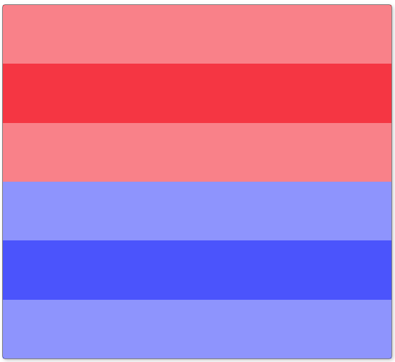
Setting grid-template-rows to auto auto « reset » the values we set for bigger screen so each « new » row on small screen can adjust automatically. You can of course define a particular size to each row if you need.
Fractional Bliss - Leveraging Fractional Units and Repeat:
The tale continues with a celebration of fractional units and the mystical “repeat”. Our grid becomes a playground of dynamic proportions:
.kingdom {
  grid-template-columns: repeat(3, 1fr); /* Hark! A three-column layout unfolds,
                                            each column a fraction of the whole! */
}
Adjusting our previous example with this new rule allows our kingdom to have equal columns.
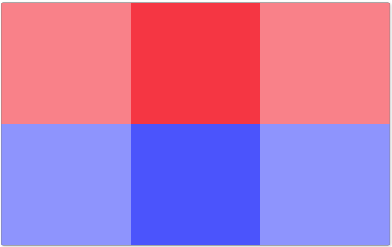
As you can see, removing grid-template-rows still gives 2 rows which are now equals. Why ? Because we have 6 children and we set 3 columns to our grid (6 / 3 = 2). The repeat function is not limited to the fraction unit, you can set for example 4 columns of 100px each.
Bravo, valiant web voyagers! You’ve just conquered the first level of the Gridception saga. Your kingdom now stands strong, boasting layouts that adapt, columns that dance, and rows that sing. Stay tuned for more grid sorcery in the next episode. Until then, may your grids be ever responsive and your web adventures full of enchantment! 🏰🌐✨
Photo of charlesdeluvio on Unsplash