
Gridception Part 2 - The Celestial Symphony of Alignment and Spacing
Greetings, cosmic architects! Prepare to embark on a celestial odyssey through the cosmos of CSS Grid in this second thrilling episode. Today, we unravel the intricate dance of alignment and spacing, where grid elements and their cosmic configurations converge in a symphony of enchantment. Let’s dive into the cosmic ballet of justify-content, align-content, place-content, justify-items, align-items, place-items, justify-self, align-self, and the mystical gap property.
Celestial Dance Floor - Mastering justify-content and align-content:
Our cosmic dance floor awaits, and with the mighty spells of justify-content and align-content, we orchestrate the grand movements of our celestial ensemble:
.cosmic-dance-floor {
  width: 800px;
  height: 500px;
  display: grid;
  border: 1px solid;
  border-radius: 5px;
  grid-template-columns: 100px 200px 100px;
  grid-template-rows: 300px 100px;
  justify-content: space-between; /* Elegantly spacing the cosmic dance,
                                     where stars align in perfect harmony
                                     horizontally! */
  align-content: center; /* Centralizing our stars,
                            creating a celestial ballet vertically! */
}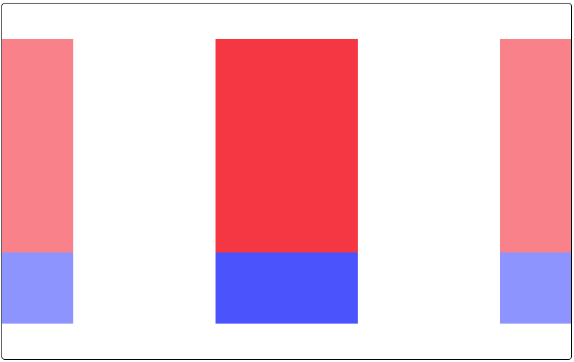
If you remember our previous episode where we discovered the new fraction (fr) unit, you may noticed we defined a fixed container with fixed columns and rows here. When using fractions, the space available in the container will be filled with the columns and/or rows you defined, meaning you will not be able to space your columns and/or rows with jutify-content or align-content, only gaps (more on that later).
In this version, our container is 800px large, we still define only 3 columns but they won’t take up the whole width of our container (100px + 200px + 100px = 400px), that leaves 400px of « free » space horizontally. justify-content allows you to tell the browser how that free space should be used. By default, our 3 columns, will be stacked at the beginning of our container (on the left). Using justify-content: space-between distribute the remaining 400px equally between our columns (400px / 2 = 200px). It works the same as for the flexbox system, except there is no main or secondary axis here, justify-content allows you to align columns and align-content will do the same for rows.
Apply the same logic to rows with align-content 🫡
Quick note: you can use place-content as a shorthand for align-content and justify-content like this:
.cosmic-dance-floor {
  place-content: center space-between;
  /* This one rule is the same as:
    align-content: center;
    justify-content: space-between;
  */
}
Stellar Beings - Aligning with justify-items and align-items:
Indulge in the cosmic ballet further with the enchantments of justify-items and align-items. These spells align the entire ensemble within their celestial containers:
.cosmic-dance-floor {
  /* Rules from our previous example apply here as well */

  justify-items: center; /* Aligns all elements horizontally at the center
                            of their celestial containers! */
  align-items: start; /* Aligns all elements vertically at the top
                         of their celestial containers! */
}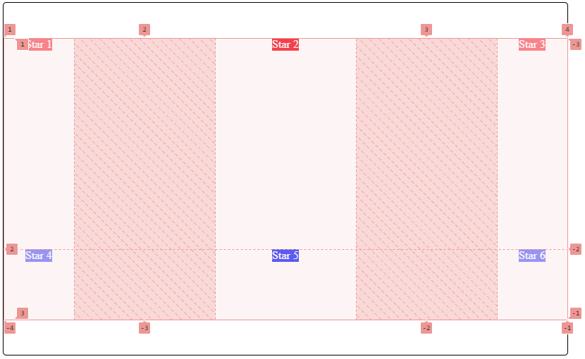
In order for you to better understand what is going on here, I activated the grid layout in the browser code inspector. If you wonder what are the numbers you see on the screen, they delimit your grid and represent you columns and rows beginning and end. You have have 3 columns with each a left and right « border », do not think of them as visual border you would apply with the border rule. The first column starts at the « border » 1 and ends at the « border » 2, the second column starts at border 2 and ends at border 3 and finally, the last column starts at border 3 and ends at border 4. These « border » numbers are presents both axis as you can see. For now, try and leave out negative numbers, they will make sense in our last gridception episode.
Hashed portions represent our free space distributed equally between our columns.
Now, as you can see, inside each grid child element (6 totals, as 3 cols * 2 rows = 6), we have basic content: text (Star 1, Star 2, etc.). justify-items and align-items allow us to place the content inside each grid child element. In this example, the text inside each child element will be placed at the start vertically and at the center horizontally.
Quick note: you can use place-items as a shorthand for align-items and justify-items like this:
.cosmic-dance-floor {
  place-items: start center;
  /* This one rule is the same as:
    align-items: start;
    justify-items: center;
  */
}
Individual Stardom - Crafting Spaces with justify-self and align-self:
Each stellar being craves its own cosmic position. Enter the enchantments of justify-self and align-self, where individual stars find their unique places:
.stellar-being {
  justify-self: end; /* Placing this stellar being at the end
                        of its cosmic path horizontally! */
  align-self: center; /* Guiding this stellar being to the center
                         of its celestial journey vertically! */
}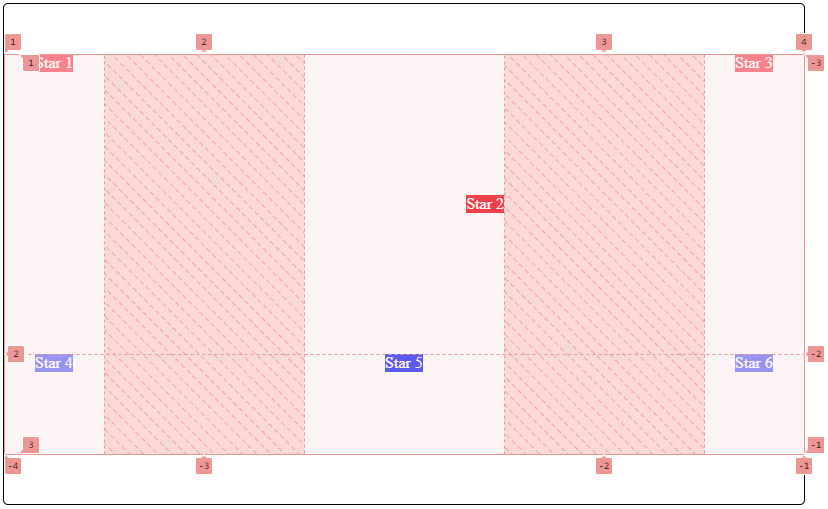
In this example we applied the stellar-being class to our second grid child (first row, second column). Its content (”Star 2”) will be centered vertically thanks to align-self: center and at the end (right) horizontally thanks to justify-self: end. These two rules allow us to place the content of a particular grid child element, or more if we apply the same class to other child elements.
Galactic Harmony - Crafting Spaces with the gap Property:
In the boundless cosmos, space is both essential and magical. In our gridception, we conjure the mystical gap property, creating breathing room and cosmic resonance:
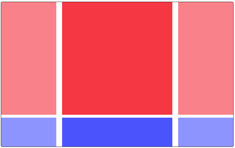
.cosmic-dance-floor {
  /* Going back to the code of our first example in our previous episode */
  width: 800px;
  height: 500px;
  display: grid;
  border: 1px solid black;
  border-radius: 5px;
  grid-template-columns: 1fr 2fr 1fr;
  grid-template-rows: auto 100px;
  gap: 10px 20px; /* Infusing a 10px gap virtically and a 20px gap horizontally,
                     allowing our stars to shine independently and dance freely! */
}
The land of possibility:
If you want to (and I encourage you to do so) experiment what we saw in this episode, here are the different values you can use for each rule:
justify-content:start | end | center | space-between | space-around | space-evenlyalign-content:start | end | center | space-between | space-around | space-evenly | stretchjustify-items,align-items,justify-self,align-self:start | end | center | stretch | baselinegap: Length values, percentages,em,rem,auto, etc.
Astounding cosmic navigators, you’ve now conducted the celestial symphony of alignment and spacing within the gridception. May your cosmic dance floors reverberate with harmony, each stellar being finding its unique place, and the spaces between them vast and enchanting. Stay çtuned for our next cosmic exploration into the celestial grid unknown! 🌌✨🚀
Photo of William Daigneault on Unsplash