
Gridception Part 3 - The Grand Masterclass of Grid Mastery
Greetings, virtuosos of the virtual city! Today, we embark on an epic expedition into the heart of the grid system of CSS one last time. We’ll navigate the intricate matrix of grid-row-start, grid-row-end, grid-column-start, grid-column-end, grid-row, grid-column, grid-template-areas, grid-area, grid-auto-flow, auto-fit, and auto-fill. Brace yourselves for a masterclass in positioning and dynamic flow, illustrated by a plethora of examples that will unravel the secrets of the grid universe.
Staking Claims with grid-row-* and grid-column-*:
In the bustling streets of Gridtopolis, elements vie for coveted spaces. Let’s witness the power of grid-row-start, grid-row-end, grid-column-start, grid-column-end, alongside their siblings grid-row and grid-column as they define territories:
/* A well organized city */
.gridtopolis {
  width: 800px;
  height: 500px;
  grid-template-columns: repeat(8, 100px);
  grid-template-rows: repeat(5, 100px);
}

.element-one {
  grid-row-start: 1; /* Beginning in the first row! */
  grid-row-end: 2; /* Ending in the first row as well! */
  grid-column-start: 2; /* Starting from the second column! */
  grid-column-end: 5; /* Ending in the fourth column! */
}
/* A shorter way to define beginnings and ends for your grid elements */
.element-two {
  grid-row: 3 / span 2; /* Occupying the third row and spanning two rows! */
  grid-column: 1 / -1; /* Commanding columns from the first to the last! */
}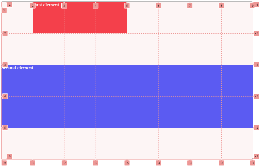
In this bustling city, grid-row-start, grid-row-end, grid-column-start, and grid-column-end, offer fine-grained control over starting and ending positions. Meanwhile, their siblings, grid-row and grid-column are the urban planners, dictating where elements establish their presence. The use of span showcases the expansive influence of these elements. Think of the span keyword as a way of telling how many rows or columns they should cover. It works exactly the same as colspan and rowspan for tables.
You might be flabbergasted by certain values used in this code, for example why do we set a grid-column-end to 5 for our first element when it clearly ends at the fourth column ? Remember the numbers can represent either, the start, the end or both of a column/row. Here, 5 is the end of the fourth column AND the beginning of the fifth column. An « easy » way to remember what number to set: when defining the start, set the number to the column/row you want your element to start. When defining the end, set the number to column/row you want your element to end, plus one.
You might wonder why our second element ends at -1, column wise ? Well as you can see, you can count columns and rows backwards. -1 represents the end of the last column/row. When you don’t want to count in your head what is the last column or row, you can set -1 to say your element will end at the last column or row.
Owning your areas with grid-template-areas, and grid-area
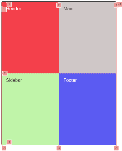
You don’t have to be a good mathematician to define how many columns and how many rows your elements should take but still, there might be an easier way to build your grid layout: grid-template-areas and grid-area.
.grid-container {
  grid-template-columns: 600px 200px;
  grid-template-rows: 100px 1fr 50px;
  grid-template-areas:
    'header header'
    'main sidebar'
    'footer footer';
}

header {
  grid-area: header; /* This element claims residence in the ’header’ area! */
}
footer {
  grid-area: footer; /* This element claims residence in the ’footer’ area! */
}
main {
  grid-area: main; /* This element claims residence in the ’main’ area! */
}
.sidebar {
  grid-area: sidebar; /* This element claims residence in the ’sidebar’ area! */
}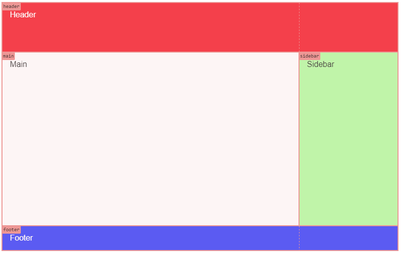
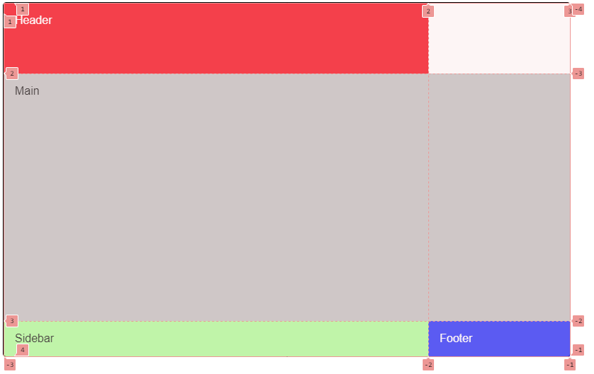
In the above example, we built a basic page layout using CSS grid. We first define how many columns and rows our grid container will have. Note that our grid container could be the body element of our HTML document. In fact, when designing your page layout using grid, it’s a good and simple way to go nowadays.
Now, instead of using columns and rows numbers to place our child elements, we define areas on our grid container using arbitrary names with grid-template-areas, meaning you get to call them whatever you want as long as it helps you visualize what you layout looks like. You may notice with four area names: header, main, footer and sidebar. Remember that our grid container has two columns and three rows, now we have to define how many columns and how many rows they will take. With grid-template-areas, you define « visually » rather than by numbers. You can see we have three lines with each two area names because we have three rows and two columns.
- “header header”: we want our header area to take the first row AND the two columns, that is why we repeat the area name twice.
- “main sidebar”: on the second line, we have two areas, main and sidebar. The main area will be placed on the second row but only on the first column, whereas the sidebar area will be on the same row but on the second column.
- “footer footer”: as for the header, our footer area will take the two columns on the last row.
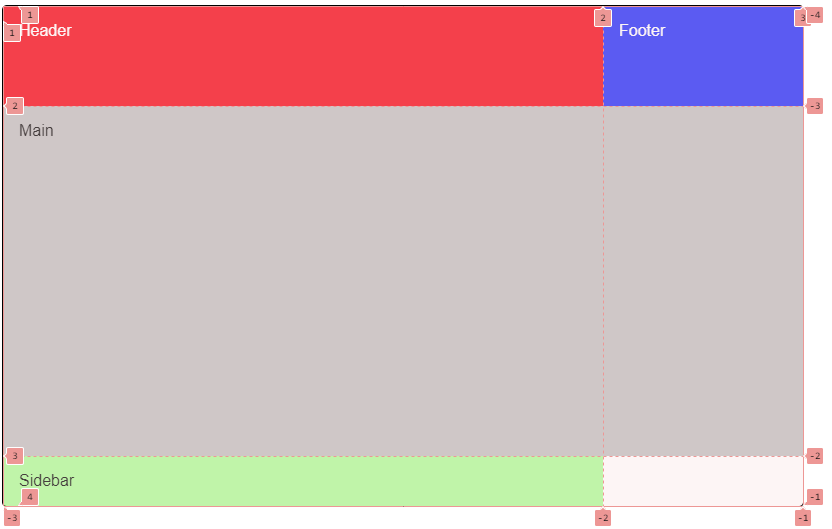
Sometimes you might want to leave some areas empty in you grid because it makes sense for the layout you envisioned. To achieve this, you just have to use a period: . like this:
.grid-container {
  grid-template-areas:
    '. header'
    'main sidebar'
    'footer .';
}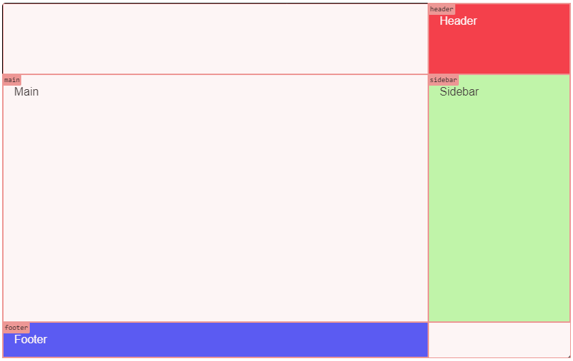
It gives us a rather special layout here but you get the gist 😉
Give it a try!
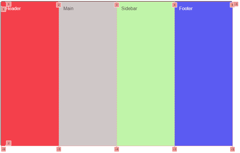
Navigating Dynamic Currents with grid-auto-flow:
As the city flows dynamically, we turn to grid-auto-flow to guide the currents. Let the examples illuminate the magic:
.grid-container {
  display: grid;
  grid-auto-flow: row dense; /* Elements gracefully follow
                                the row-based current with
                                the added ’dense’ property! */
}
Here, grid-auto-flow: row dense ensures elements gracefully traverse the cityscape in rows. The ’dense’ property optimizes the layout, efficiently filling any gaps that may appear. To demonstrate, let’s take our previous layout but without defining any area, meaning each element will take their rightfull place in the grid flow:
.grid-container {
  display: grid;
  /* We still have 2 columns and 3 rows and that’s it */
  grid-template-columns: 600px 200px;
  grid-template-rows: 100px 1fr 50px;
}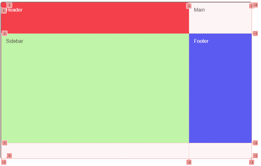
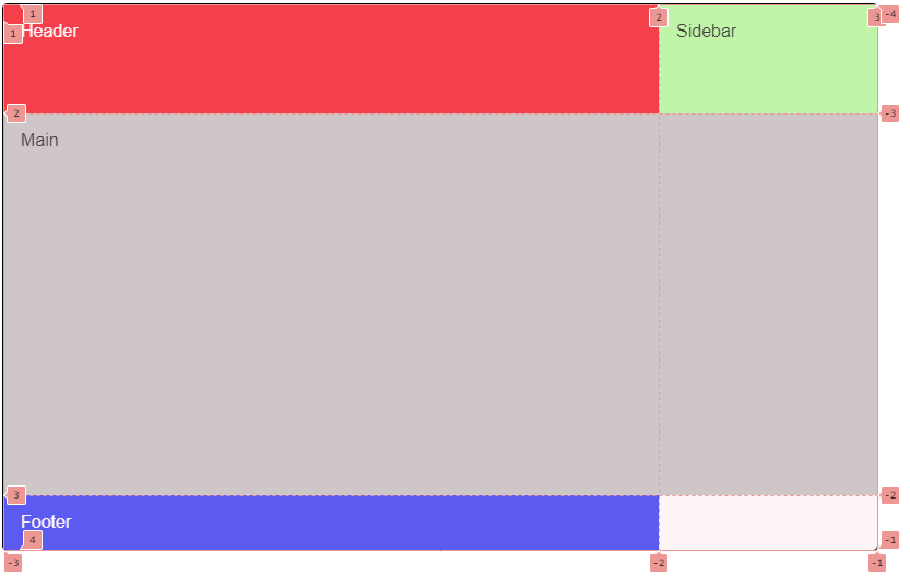
As expected, we have four elements which are distributed by the order they are defined in the HTML (header, main, sidebar and finally footer), leaving two empty cells in our grid.
Now imagine, we tell our main element to take two columns:
main {
  grid-column: auto / span 2;
  background: #ccc; /* So you can see the difference with empty cells */
}
As there is not enough space on the first row (header is taking one column out of the two available), what will happen ?
Our main element indeed takes two columns but on the next row, leaving its previous cell empty and alone. It might be fine to leave it like that, but if it’s not, we can tell our grid to optimize its children’s disposition with grid-auto-flow. By default, its value is row, meaning child element will be distributed row by row as it is in the above picture. You could order our grid container to distribute its children by column instead:
.grid-container {
  grid-auto-flow: column;
}
So, what happened here ? Well our grid now distribute its child elements by column instead of row. Of course our main element is still covering two columns because we told it to do so. But our footer is now on the top of the second column instead of the bottom because elements are first distributed on the first column as long as there is free space. After our sidebar takes the last spot on the first column, the footer will have no choice but to go at the beginning of the second column (meaning the top).
Now if we go back to a row flow instead, but telling our grid container to optimize child elements disposition like this:
.grid-container {
  grid-auto-flow: row dense;
}
The sidebar now fills up the empty cell we had on the top right corner even though it still comes after our main element in our HTML code.
This situation should not come up very often, but know that have control over it.
Bonus Magic - auto-fill and auto-fit:
Prepare for the grand finale with the enchanting auto-fill and auto-fit, where the cityscape adapts dynamically to its ever-changing landscape.
We saw in previous episodes how to adapt our grids to different screen sizes by changing their columns count with media queries. It’s fine when you need to have control. But sometimes you don’t want to specifically define how many columns your grid should have for like four or five different screen sizes. It’s a bit cumbersome. Meet auto-fill and auto-fit. Their behavior is quite similar, let’s see them in action shall we?
.grid-container {
  display: grid;
  width: 800px;
  height: 500px;
  /* Columns dynamically adjust based on content size! */
  grid-template-columns: repeat(auto-fill, minmax(150px, 1fr));
}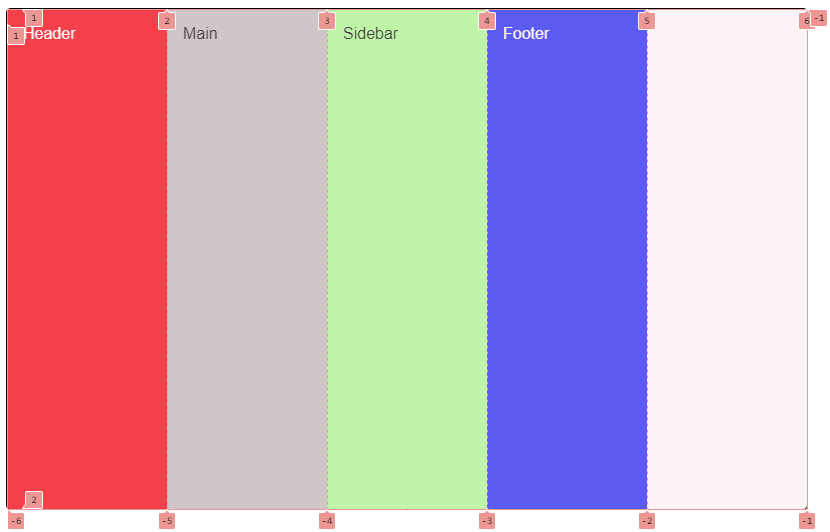
Our container is 800px large and has four child elements, still (header, main, sidebar and footer). Now when using minmax function, we tell the browser, our four elements should at least be 150px large and at most, take a fraction of their container. Now, multiply 150px by 4 (the number of child elements), it gives us 600px, leaving 200px for another cell. But wait, it would mean that we would have 5 cells total, but the last one would be larger than the other ? Well, no. With minmax, the browser understands that if there is free space after creating our four columns of 150px, then it should use the max value instead, meaning 1fr. Now as it cannot create more than 5 columns as it would need 900px, it will stop at 5 and divide its width equally (800/5 = 160), so we have 5 columns of 160px.
To simulate a smaller resolution, let’s change our container’s width to 400px:
As you can see, we have now 2 columns without having to specifically tell the browser our grid has to have 2 columns for screens of 400px or under. Following the same logic, our elements should at least be 150px large, meaning we can only fit 2 on a row. But there is still free space (100px to be precise), and that space is distributed equally among each element on a row, because the minmax tells the browser to take either 150px or 1fr if there is still space. Each element is now 200px large. What would happen if our screen resolution was under 300px ?
Now, what makes auto-fit different ?
.grid-container {
  display: grid;
  width: 800px;
  height: 500px;
  /* Columns dynamically adjust based on content size also but squish
     any empty cells! */
  grid-template-columns: repeat(auto-fit, minmax(150px, 1fr));
}
Here, auto-fit dynamically adjusts the number of columns based on content size, creating four equal columns of 200px. There is no more empty cell. Although you might notice we still have the number 6 that appears at the end of the grid lines. In reality, the last column created (the same as it was with auto-fill) is squished, or collapsed if your prefer and has a width of 0px.
If you try and reduce our container’s width, the result would be the same as with auto-fill.
Congratulations, grid virtuosos! You’ve completed the grand masterclass of Gridception, where elements stake their claims, currents guide the flow, and the city adapts dynamically. May your future urban creations be both dynamic and harmonious. Until our next venture into the CSS wonders, happy gridding! 🌇🏙️🎩
Photo of Will Suddreth on Unsplash